
In this post, I will be showing you 2 ways of creating a form to capture data in a SpFx web part. This web part can then be published and used as Teams app too. The 2 techniques that I have selected to create a form are:
- Simple ‘form’ tag
- Final Form.
If you have not used Final form before and want a quick get started information then you can refer my old blog on the same.
What are we Building?
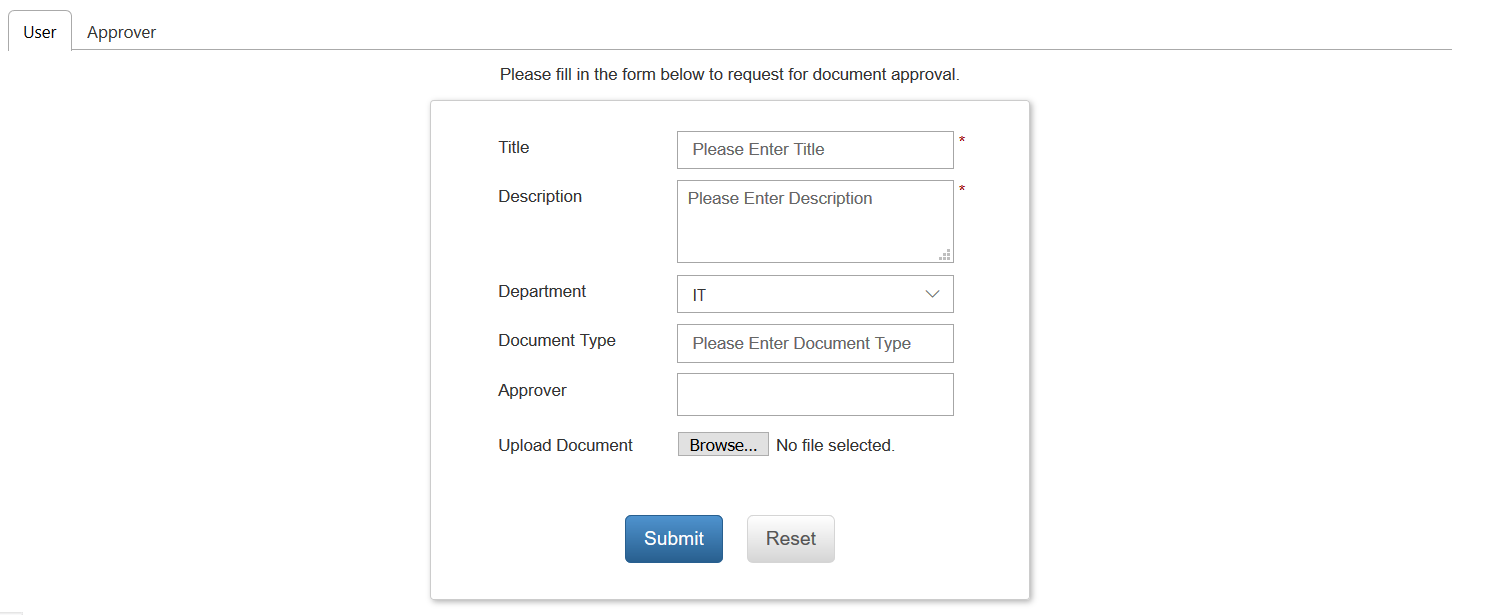
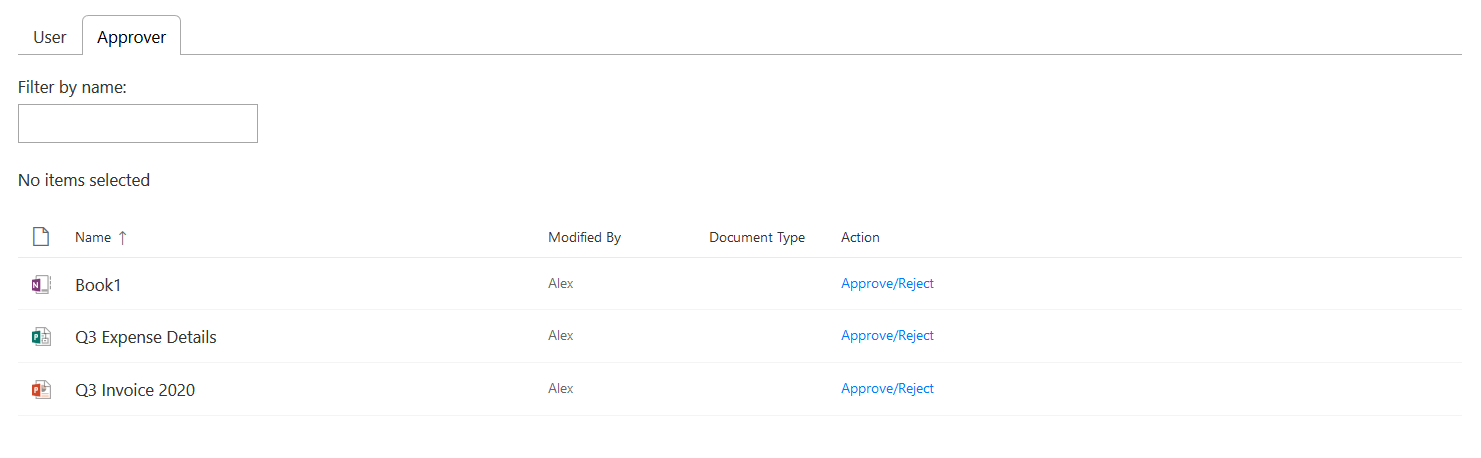
We are building a form which will capture data in the form of Text Field, Dropdown, Multiline Text, People Picker which will look for user in the current tenant, and a file upload control. The form will also show these details in a separate tab using which an approver can act in the workflow. The 2 tabs will be called ‘User’ and ‘Approver’. Here is how they will look like:
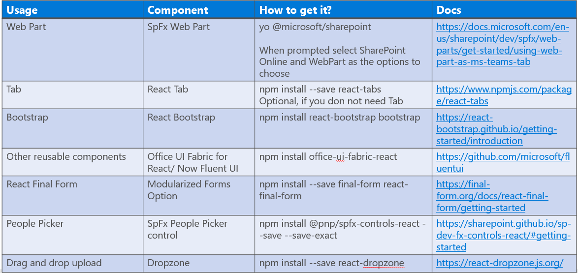
Dependencies
A few things that you need to get started are as described below:
Configurations for Different Components
Tab:
You need to install React tab to the project and then import it:
import { Tab, Tabs, TabList, TabPanel } from “react-tabs”;
import “react-tabs/style/react-tabs.css”;
Then use it to display the tabs in Render method:
public render(): React.ReactElement<ITeamsCommunicationChannelProps> {
return (
<div>
<Tabs>
<TabList>
<Tab>User</Tab>
<Tab>Approver</Tab>
</TabList>
<TabPanel>
<User
teamsContext={this.props.teamsContext}
spContext={this.props.spContext}
formDigest={this.props.formDigest}
/>
</TabPanel>
<TabPanel>
<DocumentsPendingApproval
teamsContext={this.props.teamsContext}
spContext={this.props.spContext}
formDigest={this.props.formDigest}
/>
</TabPanel>
</Tabs>
</div>
);
}
Over here, I am creating 2 tabs: User and Approver. I am also plugging in respective components for both of them. ‘User’ for the user component and ‘DocumentsPendingApproval’ for Approver tab with their desired props.
Offce UI Fabric:
This is for the grid to be displayed in the Approver tab. Now the Office UI fabric has been re-branded into Fluent UI. You can check them out here on Github.
People Picker:
I thought of using the SpFx React based control for this. Once you have it installed, you can import it into your project with the code described below:
import {
PeoplePicker,
PrincipalType
} from “@pnp/spfx-controls-react/lib/PeoplePicker”;
Then use it:
{/*Approver*/}
<div className=“col-md-4 space”>
<label className=“ms-Label”>Approver</label>
</div>
<div className=“col-md-7 space”>
<PeoplePicker
context={this.props.spContext} //titleText=”People Picker”
personSelectionLimit={3}
groupName={“”}//Leave this blank if you want to filter all users
showtooltip={true}
isRequired={true}
disabled={false}
ensureUser={true}
selectedItems={this.getPeoplePickerItems.bind(this)}
showHiddenInUI={false}
principalTypes={[PrincipalType.User]}
resolveDelay={1000}
errorMessage=“Please enter approver”
// peoplePickerWPclassName=”form-control”
// peoplePickerCntrlclassName=”form-control”
/>
</div>
Dropzone:
Dropzone can be imported with following piece of code:
import * as Dropzone from “react-dropzone”;
Use this as:
<div className=“text-center mt-5”>
<Dropzone.default onDrop={this.onDrop}>
{({ getRootProps, getInputProps, isDragActive }) => (
<div {…getRootProps()} className=“dropzone”>
<input {…getInputProps()} />
{isDragActive
? “Drop here…”
: “Click here or drag a file to upload.”}
</div>
)}
</Dropzone.default>
</div>
Please be mindful that Dropzone uses React Hooks which is part of React 16.8 version. If you are not using the version 16.8 or latest in your SpFx webpart then you will need to make certain changes to your code. This article describes the changes beautifully.
Final Form:
I have created different Components for each control where ever needed. Basic example is as follows from my code sample in my User.tsx
render() {
return (
<Styles>
<div>
Please fill in the form below to request for document approval.
</div>
<Form
onSubmit={onSubmit}
initialValues={{ department: “IT” }}
render={({ handleSubmit, form, submitting, pristine, values }) => (
<form onSubmit={handleSubmit}>
<Field
name=“title”
component={Input}
label=“Title”
title=“Title”
placeholder=“Title”
validate={validate}
/>
Input.tsx file:
import * as React from “react”;
import { Form, Field } from “react-final-form”;
const Input = props => {
const { placeholder, label, input, meta } = props;
return (
<div className=“form-group row”>
<label className=“col-md-4”>{label}</label>
<div className=“col-md-7”>
<input
type=“text”
{…input}
placeholder={placeholder}
className=“form-control”
/>
</div>
<div className=“col-md-1”>
{meta.error && meta.touched && (
<span className=“text-danger”>{meta.error}</span>
)}
</div>
</div>
);
};
export default Input;
That’s pretty much all that you need to get started with forms depending on which version you need.
You can check out my git repository for both the samples. The code is not production ready but to an extent optimized to provide good idea on how to create forms in SpFx webparts with common controls.

Shiva Excellent Article!!! I am having a similar requirement can you share this solution shiva it helps..
Thank you – this was very helpful.
Will it work for submission by external users/guest users ? Will the upload work for external users ?
Sorry for the late reply, Dan! I have not tested it.